contact us

Use the form on the right to contact us.

You can edit the text in this area, and change where the contact form on the right submits to, by entering edit mode using the modes on the bottom right.


123 Street Avenue, City Town, 99999

(123) 555-6789

email@address.com


You can set your address, phone number, email and site description in the settings tab.
Link to read me page with more information.

2014-09-14 07.31.25 1.jpg

house blog

projects around the house


Filtering by Category: before and after

a shortcut.

jenn pan

as much as we love the new front door, the new one at the rear of the house may take the cake. the existing door was one of my least favorite things about the house. it was just an aluminum sliding door. and it was ugly. the back of the house also faces southwest, so it would let in a lot of hot afternoon sun. we put some old blackout curtains we had from james's old apartment up to help with both situations, though it didn't completely solve either. 

upload.jpeg
upload.jpeg

but besides being ugly, it was also nearly non-functional. the door itself had no real locking mechanism. just a few holes roughly drilled into the aluminum framing, which was difficult to actually lock. and even then, if you pulled hard enough, it would still pop open. so not only could it not be locked or unlocked from the outside, it was also just not safe. we never advertised this before, but now that it's gone, we can show you our janky security system for that door:

upload.jpeg

needless to say, it was a pain in the butt to get in and out of, so we mostly avoided it. which was also a bummer because the garage (or hangar, as we call it) is behind the house, and it would be so much easier to be able to enter/exit the house this way, than to go all the way around to the front door. but that's exactly what we did for over a year and a half! but now it has all been resolved, and it is pretty, and functional, and convenient, and we love it!

upload.jpeg

as you can see, even with the sidelight, it is still smaller than the old door, so we have a bit of exterior wall to patch up. while the knob is from emtek like the hardware on the front, the lock itself is a kwikset smartcode lock, which means one less key to carry around or fumble with! and we can also hook it up to vivint, our home security system, so that we could lock/unlock it remotely, which certainly has its benefits!
upload.jpeg

the new front door!

jenn pan

it's happened. it has finally, finally happened. the new doors are IN. this post is dedicated to the front door, but before we see the final outcome, let's look at where we started.

upload.jpeg

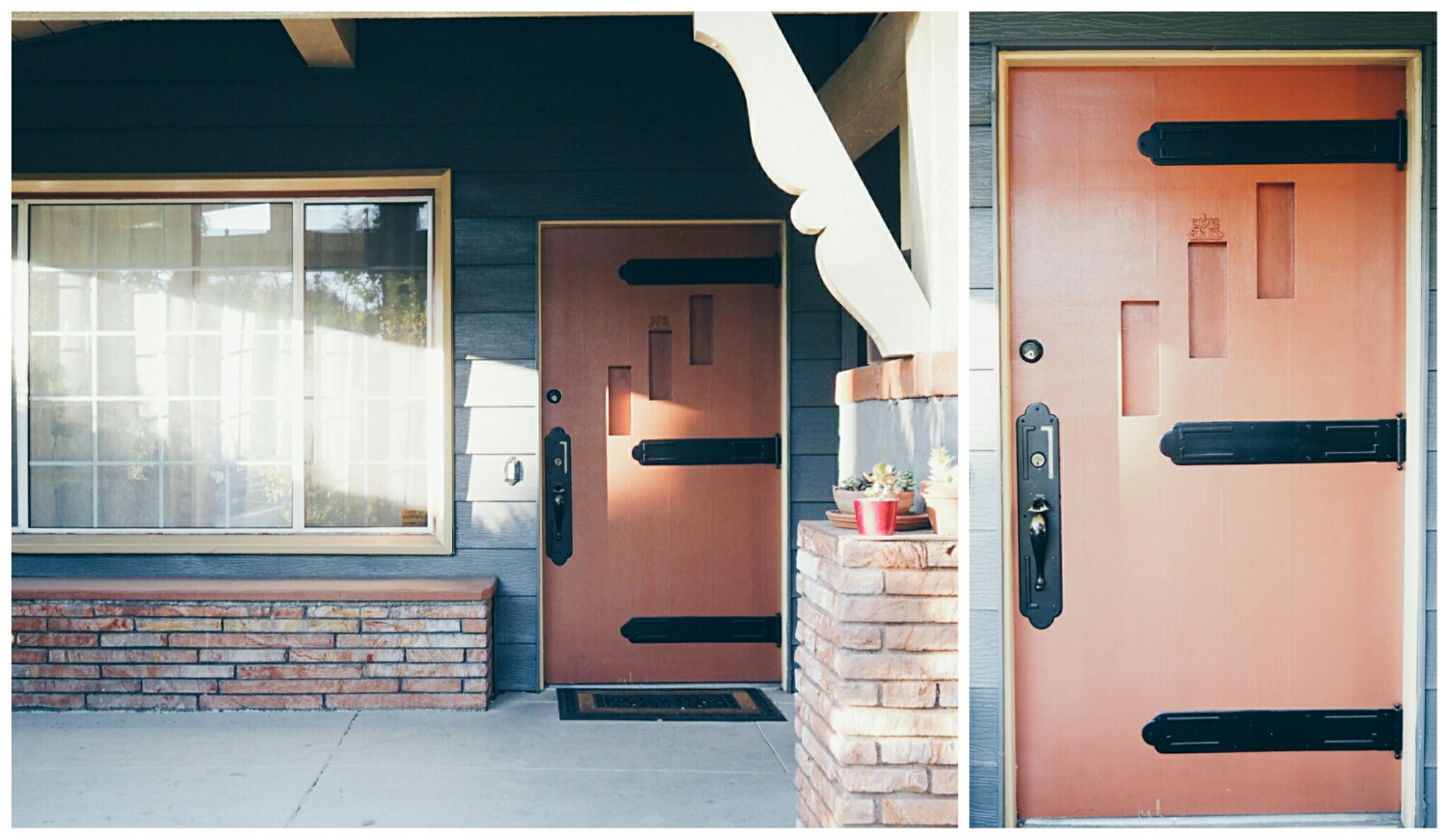
the old door was BIG and solid wood. we liked these things. however, it was very old, and had been painted over multiple times. see that sort of scrubby detail above the center painted-over "window"? yea, it's a little "shalom" in both english and hebrew that the house flippers did not even bother to remove before they painted over it. it was also a not-very-pleasant (but also not unpleasant) shade of burnt orange. this was the least of our concerns. mainly, the door was a pain in the butt. it was very difficult to open and close, and even more difficult to lock and unlock - which required some lifting - because it was literally falling off the hinges. after shoving toothpicks into the stripped holes a few months back, the door hasn't been as bad as it was for the first year of living in the house, but it still took a good bit of effort to get in and out of on a daily basis.

upload.jpeg

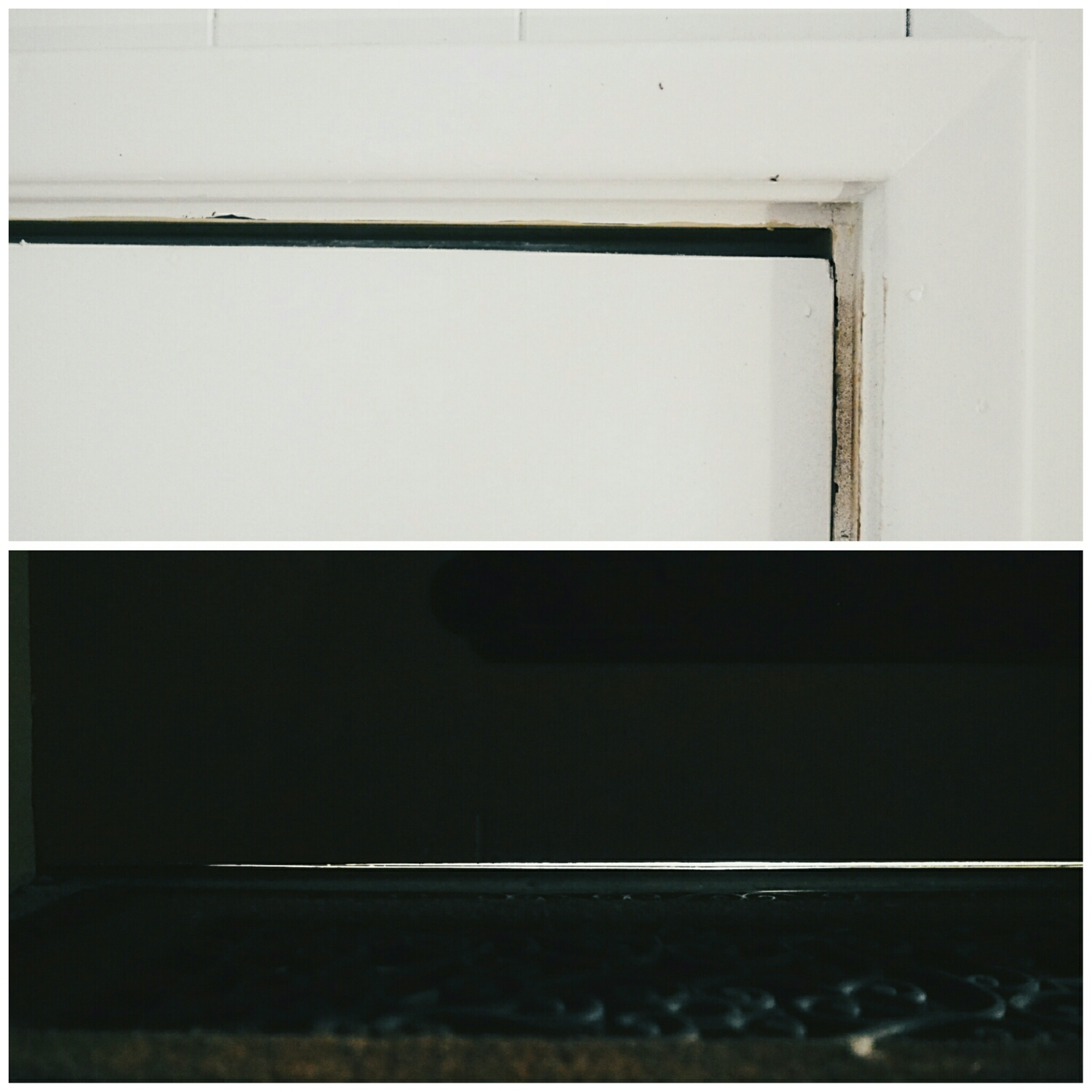
another side effect of it falling out of the hinges, is that the door was not square or sealed! from the inside, you could easily see how much of the weight of the door was actually pushing into the frame, thus requiring the lifting to open or close. from the outside, you can see that there was a considerable gap between the bottom of the door and the threshold. this meant we constantly had crickets making their way into the house from the outdoors. once, a very large cockroach even crawled in from under the door. also, twice a month we'd have a ton of dirt and debris blown into the house by the bi-weekly landscaping crew.

upload.jpeg

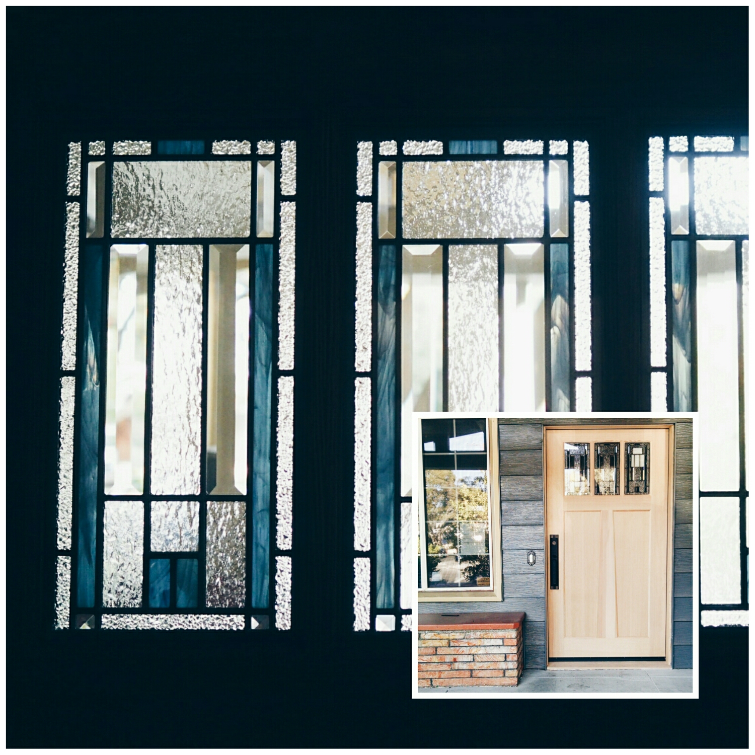
one of my favorite things about the door is the decorative glass. it's just so darn pretty. it also works well with the shade of blue the house is painted. 

upload.jpeg

it was not easy picking a stain for the doors. we wanted something "dark-but-not-too-dark and warm-but-not-too-warm". we started with four samples from minwax, which is both a stain and sealer (important for exterior doors!). the colors were dark walnut, english chestnut, jacobean, red mahogany. the jacobean and red mahogany were just too dark. the english chestnut too red. we liked the dark walnut, but just felt it wasn't warm enough. it was also hard to judge because the 2x4 we bought at the hardware store was very knotty and obviously not stain-grade like our doors and so had lots of variation in color. for our second round of stain tests, we bought honey, early american and cherry. we really liked both the honey and early american, but ended up going with honey. the funny thing is, we almost didn't even buy it!

upload.jpeg

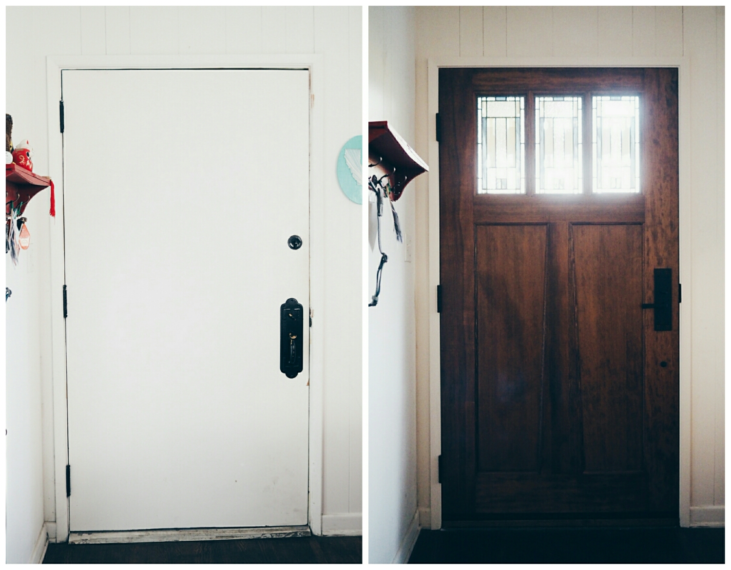
i am utterly in love with the final color. i think the honey hits the perfect balance of dark and warm that we were looking for. the pictures really don't do it justice because they are kind of blown out. and the chunky dentil shelf? and angled mutt (panels)? i'm really in love with this door.

upload.jpeg

the craftsman entry lock from emtek turned out really nice. i still wish it weren't hammered, but it's not very noticeable since it's a nice matte black. we've been using it for a few days now and i still revel at how easy it is lock and unlock the door. single-handed!

upload.jpeg

and look! a real, solid wood threshold! and a sealed door, where not dirt, debris or insect can enter from!

upload.jpeg

and last but not least, here is the new door in all it's glory. needless to say, we are really, really happy. 

upload.jpeg

a new rug in the living room.

jenn pan

upload.jpeg

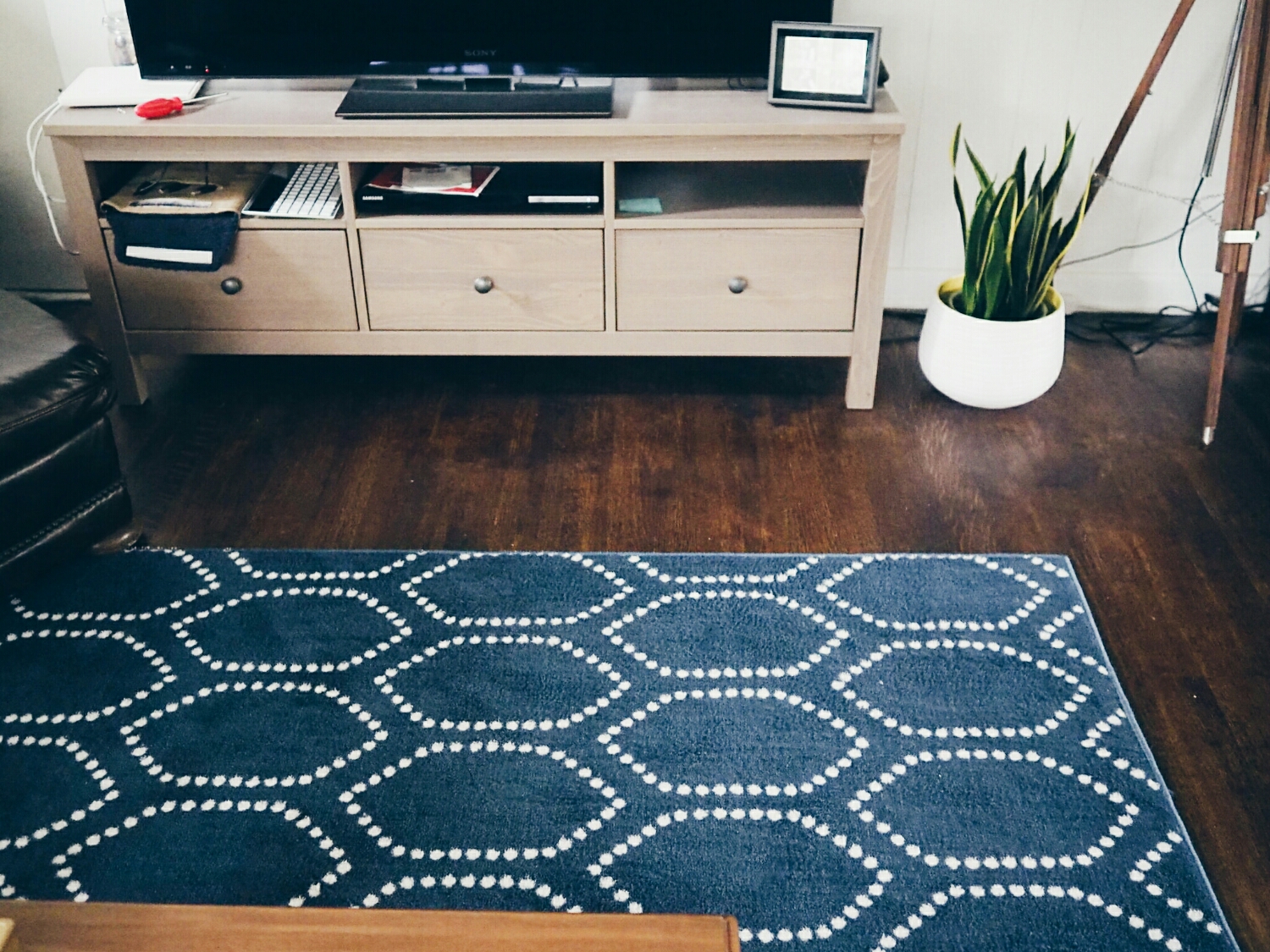
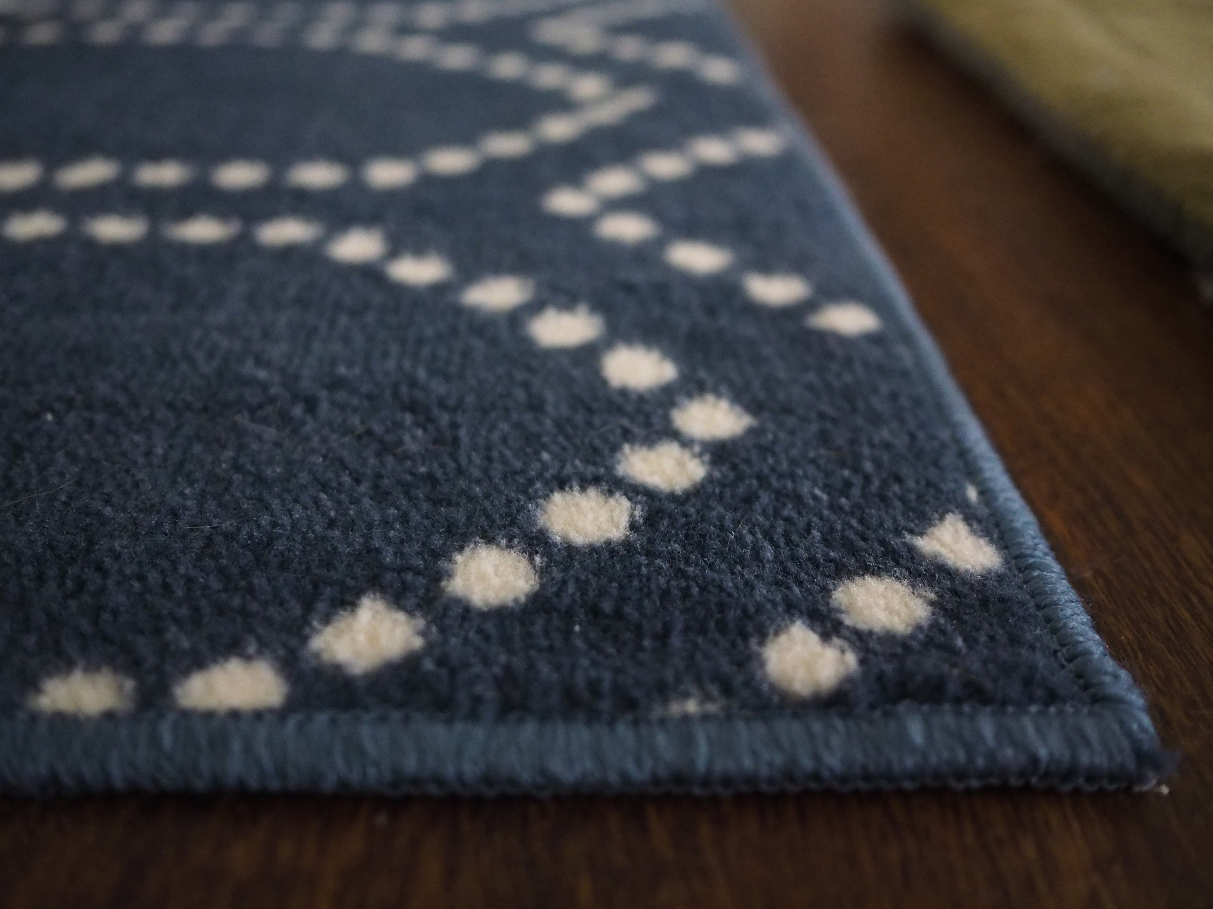
we got a new rug for the living room!! it's the threshold dot tile rug in blue from target. it's one of those purchases that makes us feel more like adults (at least for me, jenn, it does). the rug we had been using was a rug i'd bought a few years back for my bedroom in an old apartment. it really didn't fit in with our living room, but it was a rug, we haven't felt the need to spend money on replacing it.

the old rug.

the old rug.

as you can see, it was a thin rug, and thus moved around a lot. especially with a nut of a dog like sanford, who will go on running tears through the dining and living room, it would often end up looking something like this:

what a jerk.

what a jerk.

getting a rug pad to put underneath it helped, but it was still too light to even be able to vacuum easily. this new one is much more stable - i even already vacuumed it and was amazed by the difference!

in the end though, i just think it looks so much better. it's got more weight (physical and visual!) to it, making the living room feel more grounded and less haphazard. it's been in place for a little under two days, and both of us have already, randomly set out loud how much we love it. multiple times. it's that great!

upload.jpeg